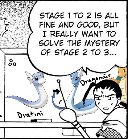
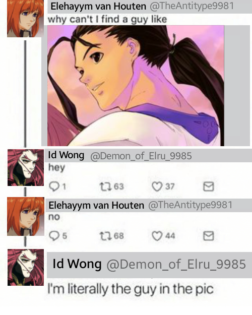
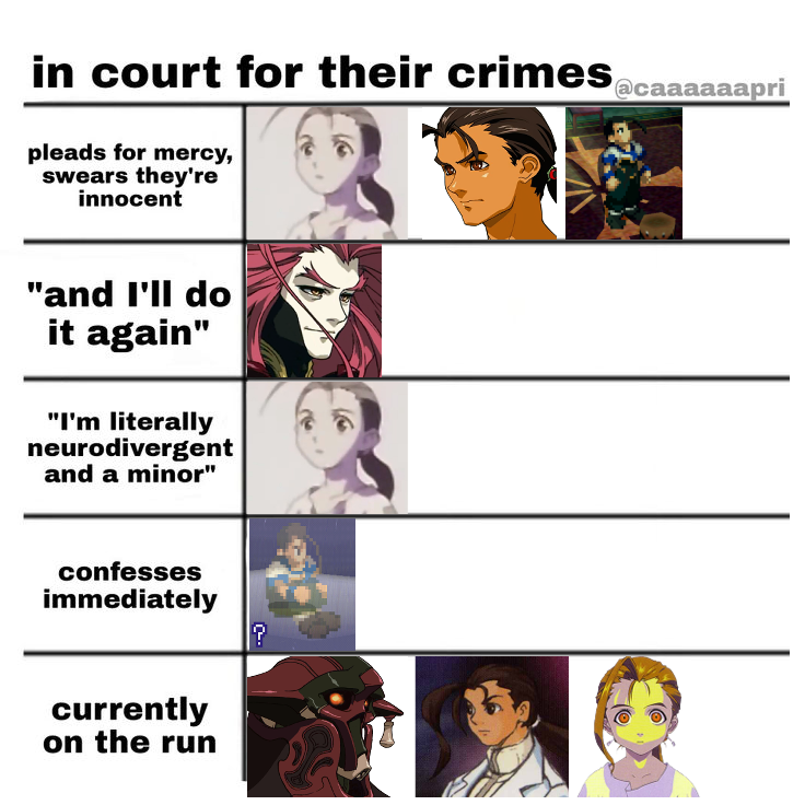
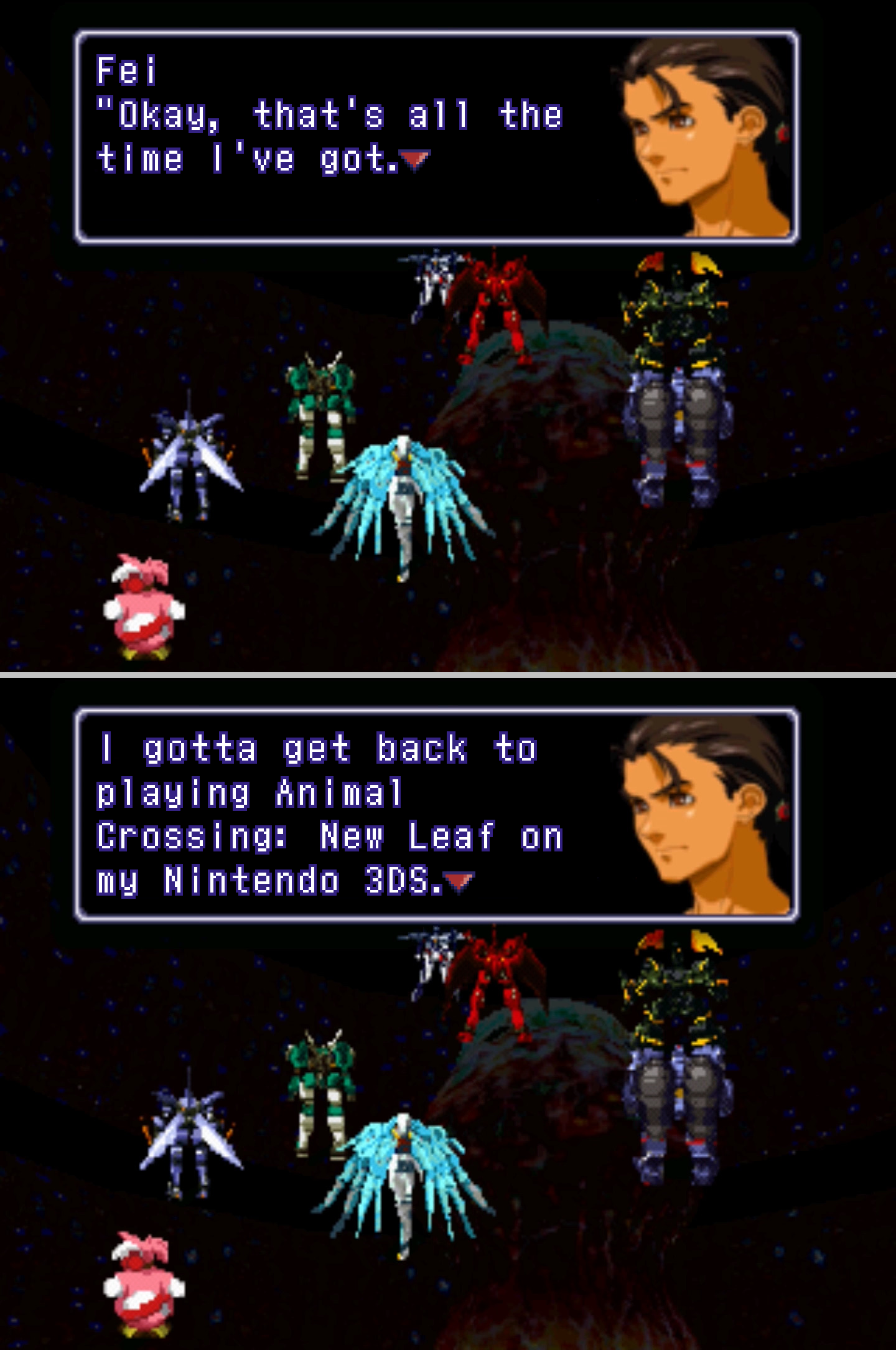
Love these!

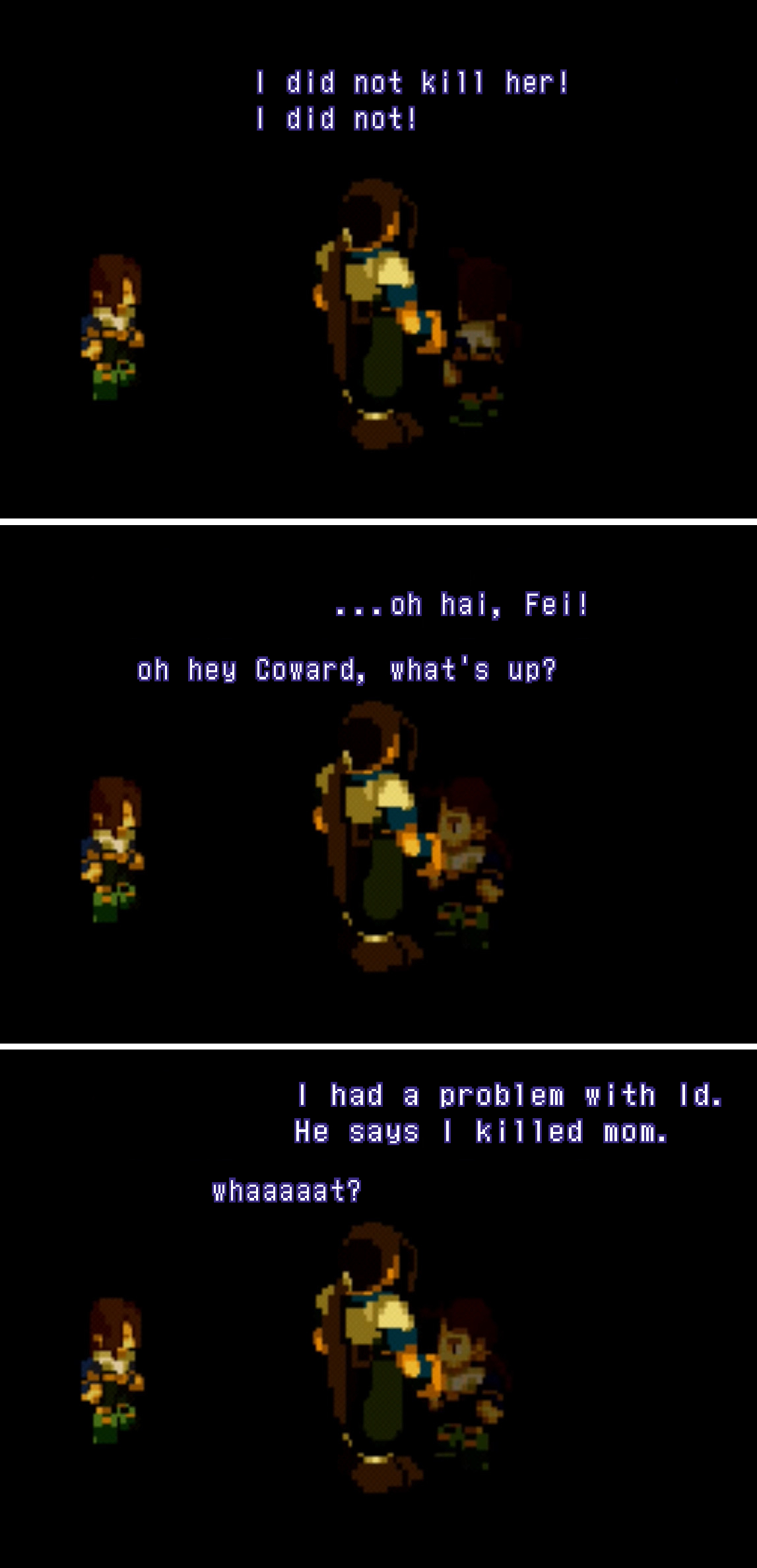
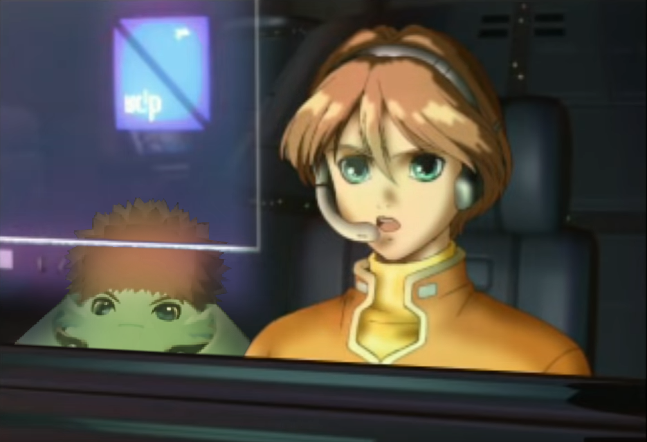
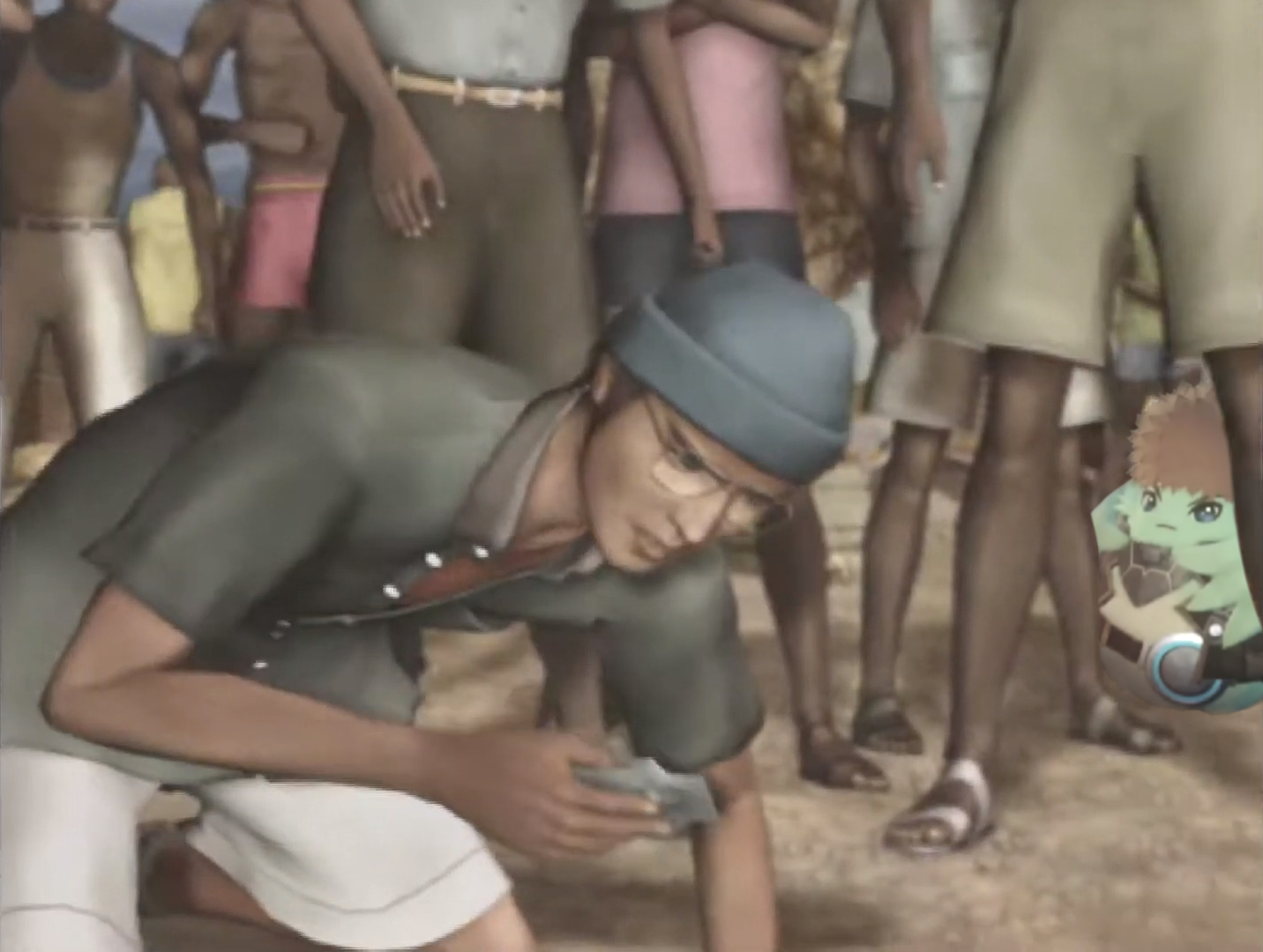
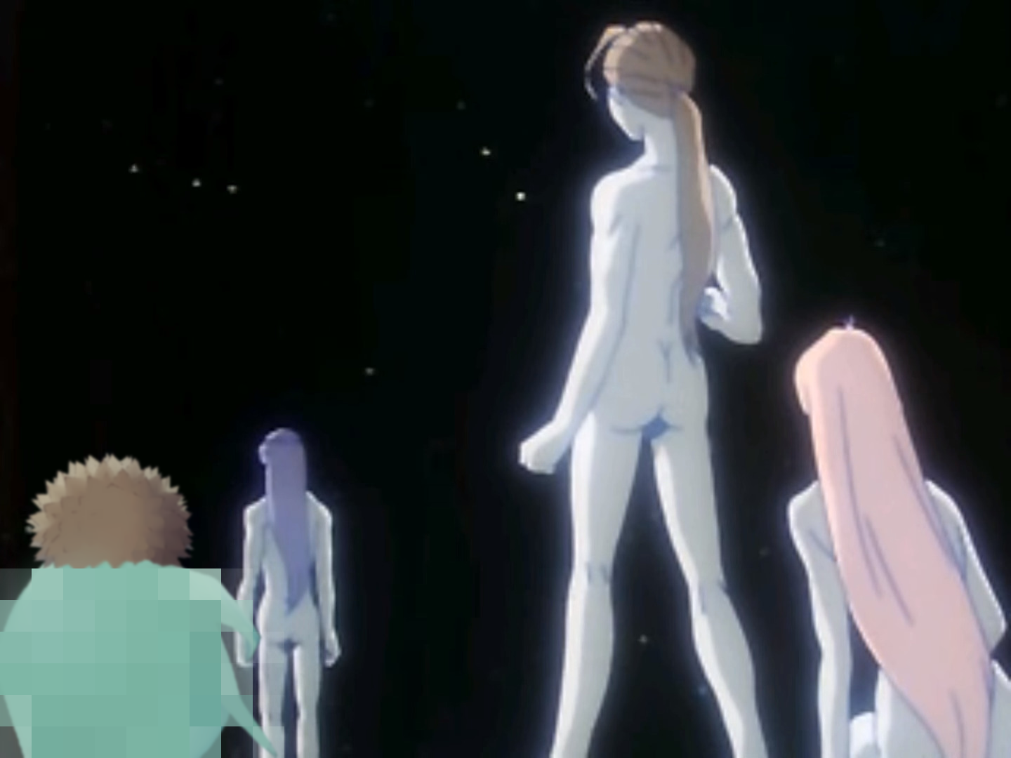
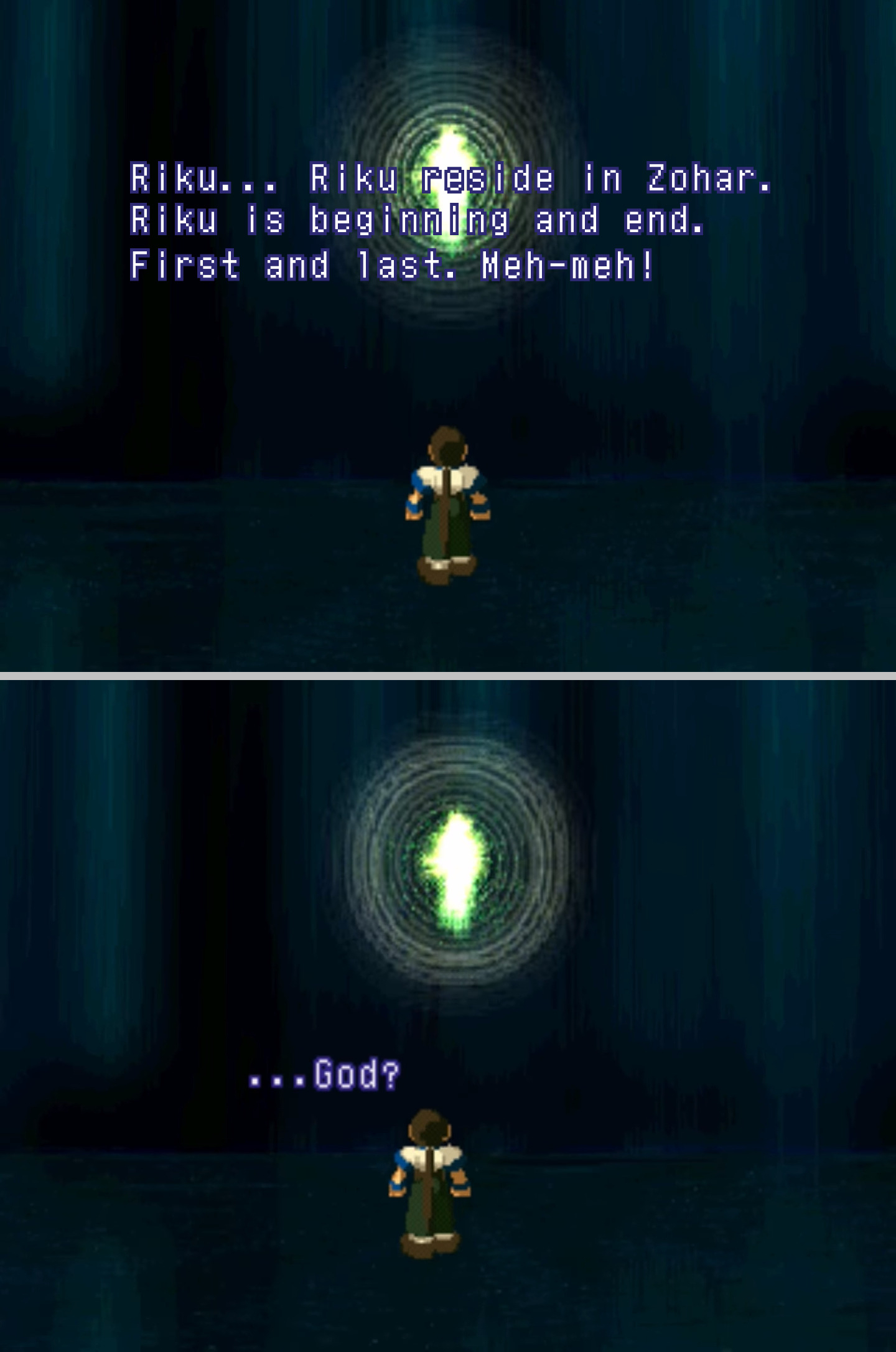
Btw, what's the font you use for the Xenogears text? I've always been curious and don't think I ever found it before. Perhaps I didn't look hard enough

At first in the past I used "Xeno Standard" by someone over on Fontstruct, but parts of it bothered me. Like there were aspects of the punctuation and the line spacing that was off, and the capital J wasn't exact, so I went and made my own version. Got it here in
my misc MEGA folder. So that explains why you never found it if you never came across my tweets about it

Actually, just recently I fixed something that'd been bugging me about it so it's at
"1.2" "1.3" now and I don't think there's anything else that needs fixing that I can see so I think this is the definitive version... unless I decide to add hiragana and katakana in the future.
Its the one titled Perfect Words
1.2 1.3 in that folder. (The other one is for the Perfect Works Build devs; its punctuation is slightly altered how they prefer it.)
So you use the typeface in the appropriate light grey (E6E6E6. nearly white, 90%), then create a selection of the text, expand it by however much depending on your typeface size, and fill with the appropriate purple (31217B?) in a layer behind the text.
Things to make sure of when it comes to the width of your expanded selection for the purple outline is that lowercase a/s/g should have no blank spots in their center, but lowercase d/p should have 1 "typeface square pixel" in their center that isn't filled in.
Also, lowercase s and a shouldn't have any blank spots within their purple (I mention this bc, for example, sometimes when expanding the selection
(ofc this is depending on the size of my typeface and how much Im having to expand the selection by) I end up with tiny sections within the curves of the s that need filling in).
Also also, that each letter's purple outline should be one "typeface square pixel" apart from any adjacent letter's purple outline.
